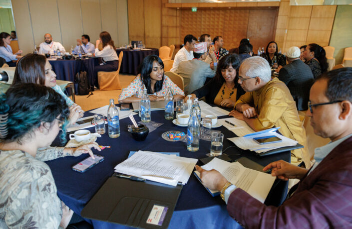
2024 General Assembly
The 2024 Humanists International General Assembly will take place in Singapore from 30 August until 1 September 2024, hosted in…
Read More


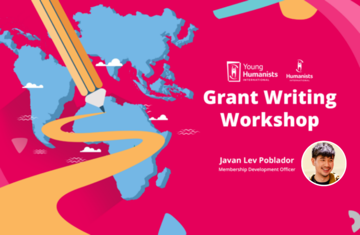
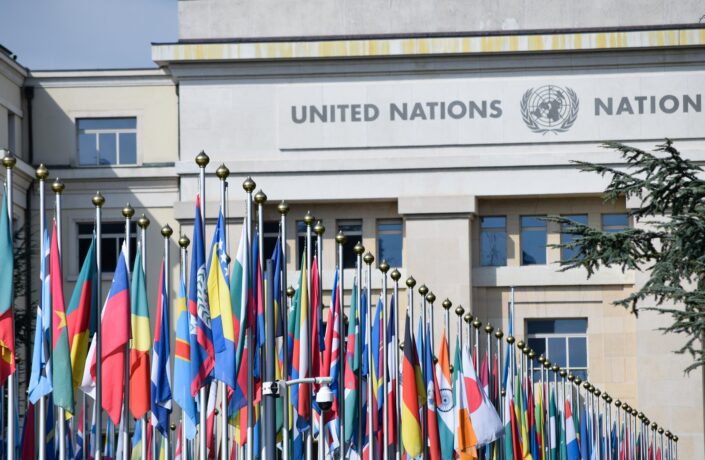
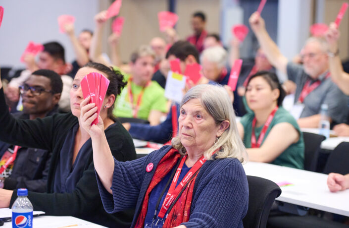
We campaign on humanist issues. We defend humanists at risk of persecution and violence. We lobby for humanist values at international institutions, including the United Nations. And we work to build and support the humanist movement around the world.
Read more
26 April 2024 | Singapore

24 April 2024 | Northern Europe

11 April 2024 | Peru

8 April 2024 | 13531, Planá nad Lužnicí, Czechia

27 March 2024 | Greece

27 March 2024 | Libyan Arab Jamahiriya

26 March 2024 | Germany
12 March 2024 | Ndélé, Central African Republic
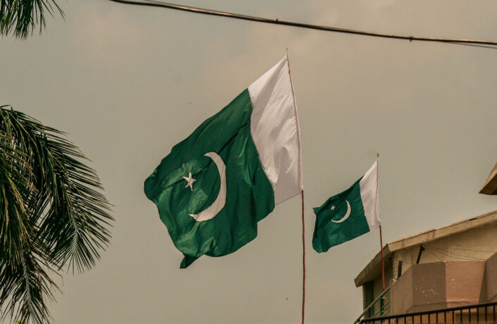
11 March 2024 | Pakistan
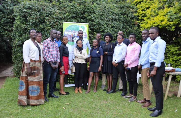
8 March 2024 | Uganda

26 January 2024 | Romania

22 November 2023 | B9, Kenya

21 November 2023 |
31 October 2023 | Nepal

18 September 2023 | Mauritania

11 September 2023 | 6 Triq Ganni Portelli, Attard, Malta
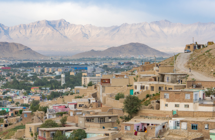
17 August 2023 | Afghanistan
16 August 2023 | Denmark
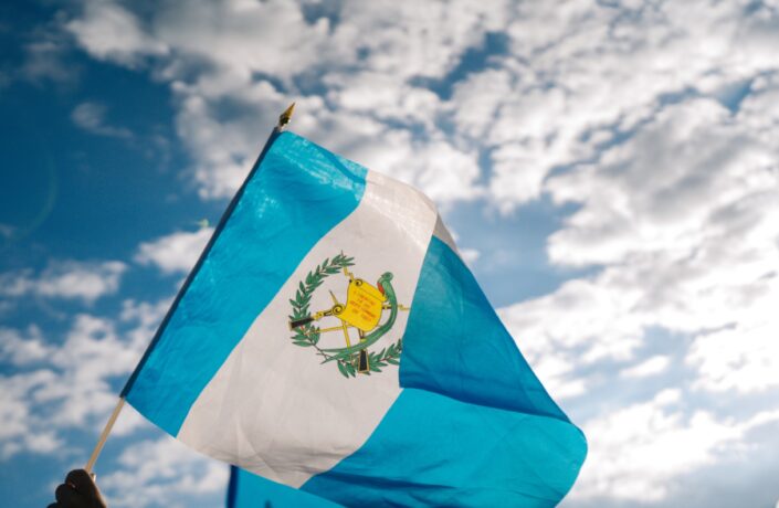
7 July 2023 | Guatemala
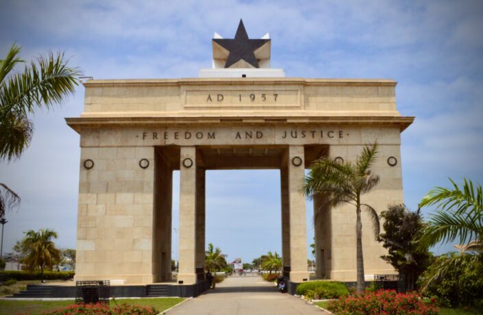
7 July 2023 | Pru, Ghana

6 June 2023 | Hungary

31 May 2023 | Bangladesh

12 April 2023 | Canada